Data can be overwhelming, but Excel’s CORREL function helps you cut through the noise. Calculating the correlation coefficient is your secret weapon for finding hidden trends and making smarter decisions.
What is the CORREL Function in Excel?
CORREL is a statistical function in Excel that measures the relationship between two data sets. It calculates the correlation coefficient—a value between -1 and 1 that indicates how strongly two variables are linearly related. Following is the syntax for the CORREL function in Excel:
=CORREL(array1, array2)
Array1 and array2 are the two ranges of data you want to analyze.
A correlation coefficient 1 would mean a perfect positive correlation, while -1 indicates a perfect negative correlation. A value of 0 suggests no linear relationship. This way, CORREL helps you quantify the strength and direction of these relationships in your data.
Preparing Your Data for the CORREL Function
Before you can use the CORREL function, it’s important to prepare your data properly. You should start by organizing your data into two separate columns or rows—one for each variable you want to analyze.
Make sure that each data point has a corresponding value in the other data set. If there are missing values, Excel will ignore that pair of data points when calculating the correlation coefficient.
It’s also important to check for any outliers or inconsistencies in your data. These can significantly impact the correlation coefficient and skew your results. You should consider removing or adjusting these values if they’re not representative of the overall trend, as a little bit of data cleanup goes a long way in Excel analysis.
How to Use the CORREL Function in Excel
Now that you understand what the CORREL function does and how to prepare your data, let’s walk through an example to see how the CORREL function is in action.
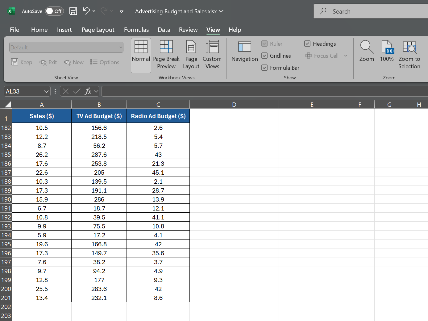
Suppose you’re a sales manager analyzing data from the past year. You have three data sets: monthly sales revenue, advertising spending on TV, and advertising spending on radio, each with 200 data points.
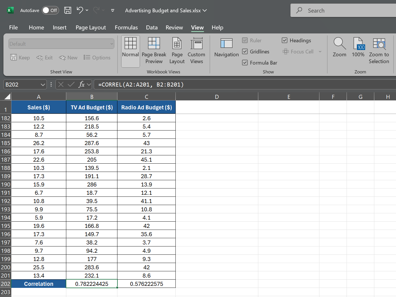
To calculate the correlation between sales revenue and advertising spend on TV, select an empty cell and type:
=CORREL(A2:A201, B2:B201)
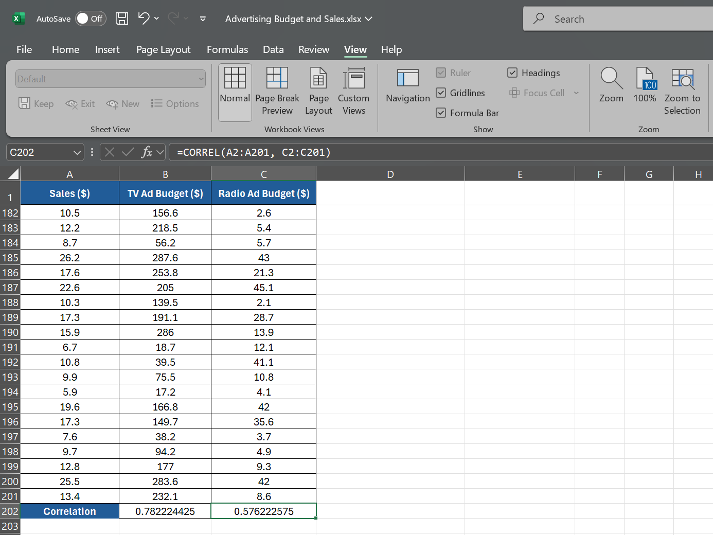
This formula tells Excel to calculate the correlation between the sales revenue data in A2:A201 and the advertising spend data on TV in B2:B201. Next, to calculate the correlation between sales revenue and advertising spend on radio, use the following:
=CORREL(A2:A201, C2:C201)
This will give you the correlation coefficient between the sales revenue data in A2:A201 and the advertising spend on the radio in C2:C201.
Suppose the first formula returns a correlation coefficient of 0.78, indicating a strong positive correlation between advertising spend on TV and sales revenue. The second formula returns a correlation coefficient of 0.576, suggesting a weaker positive correlation between advertising spend on radio and sales revenue.
Visualizing Correlations With Scatter Plots
While the CORREL function will provide you with a numeric value for the correlation coefficient, sometimes a visual representation can be more impactful. Let’s create a scatter plot to visualize the relationship between the variables.
Again, consider the previous example of a sales manager analyzing data from the past year with three data sets: TV Ad Budget ($), Radio Ad Budget ($), and Sales ($). To create a scatter plot for this example:
- Select the data range containing the TV ad budget and sales data, including the headers. In the example, the TV ad budget data is in column B, and sales data is in column A, rows 2 through 201.
- With the data selected, go to the Insert tab on the Excel ribbon.
- In the Charts section, click X Y (Scatter).
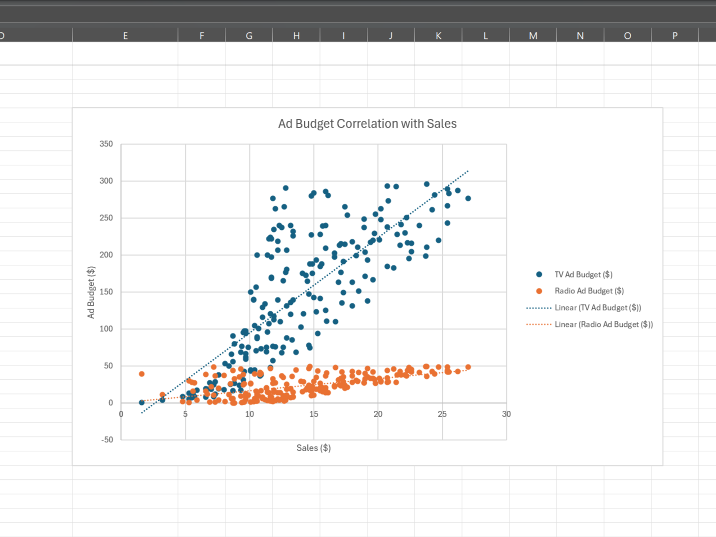
- Excel will automatically create the scatter plot based on your selected data. The sales data will be on the x-axis, and the TV ad budget data will be on the y-axis. You can add axis titles for better formatting.
- To add the radio ad budget data to the chart, right-click on the chart and click Select Data from the dropdown menu.
- Click Add under Legend Entries (Series) in the Select Data Source window.
- For the Series name, select the cell containing the radio ad budget.
- For the Series X values, select the sales data range (column A, rows 2 through 201).
- For the Series Y values, select the radio ad budget data range (column C, rows 2 through 201).
- Click OK to apply the changes and close the Select Data Source window.
Your scatter plot will display two series: one for the relationship between TV ad budget and sales and another for the relationship between radio ad budget and sales. This allows you to visually compare the correlations and determine which advertising medium has a more substantial impact on sales.
Scatter plots make it easy to spot outliers, clusters, and trends in your data. By combining scatter plots with the CORREL function, you get a quick overview of your data—saving you tons of Excel work.
The CORREL function is a powerful tool on its own, but when combined with other Excel features, it becomes even more potent. Two key tools that can enhance your correlation analysis are PivotTables and the XLMiner Analysis ToolPak.
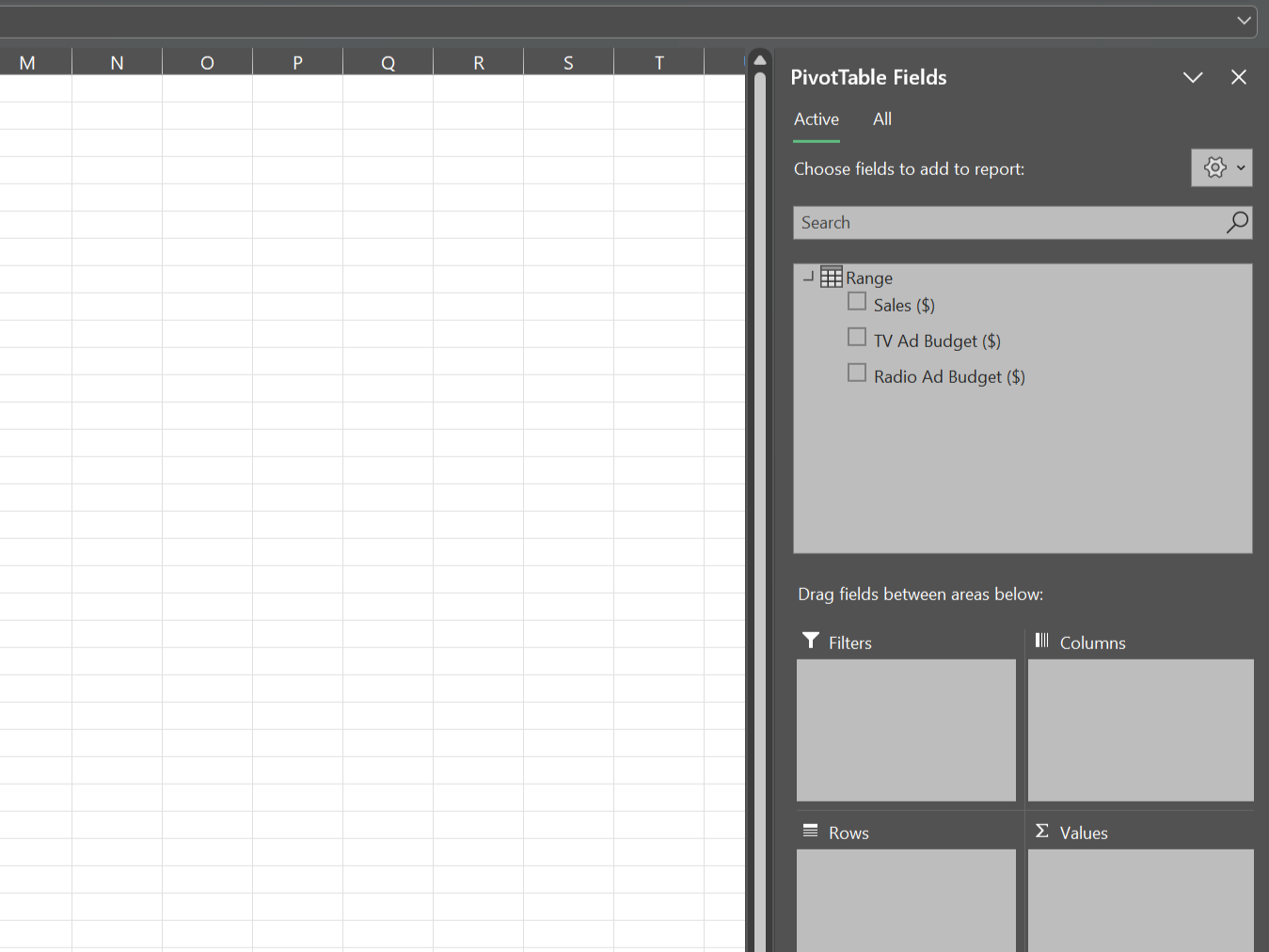
PivotTables in Excel allow you to summarize and analyze large datasets quickly. Using a PivotTable, you can easily calculate correlations between variables and spot trends across multiple dimensions.
For example, suppose you have sales data broken down by region and product category; you can use a PivotTable to calculate the correlation between sales and various factors like price, advertising spend, or customer demographics for each combination of region and category.
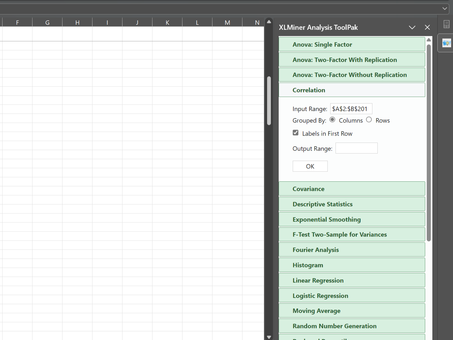
The XLMiner Analysis ToolPak is an add-in that provides advanced statistical functions, including correlation. While the CORREL function calculates the correlation between two variables, the Correlation tool in the XLMiner Analysis ToolPak can calculate correlations for an entire dataset in one go.
The CORREL function is a powerful tool for analyzing relationships in your data to gain deeper insights. However, if you want to analyze your data over time, the TREND Function in Excel is another great tool to explore.

